힘펠(대표 김정환)이 35년 환기 기술력을 바탕으로 환기가전 브랜드 가치를 확립하고 고객 중심 혁신을 위해 브랜드 리뉴얼을 진행했다.
힘펠은 CI(Corporate identity)를 아마존 그린 컬러로 바꾸고 ‘숨쉬는 집’의 슬로건과 브랜드별 컬러 및 전용 글꼴의 BI(Brand Identity)를 새롭게 적용했다고 23일 밝혔다. 지난 2010년 힘펠로 사명 변경 이후 약 15년만에 진행된 리뉴얼 프로젝트이다. 35년 업력인 환기가전 전문 브랜드로서의 입지를 다지고 제품별 브랜드 경쟁력을 강화하기 위해 진행됐다.
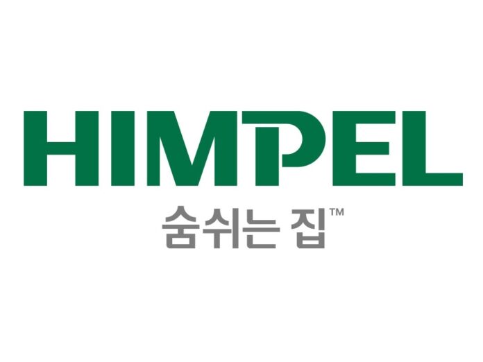
힘펠의 CI는 디자인과 색상 모두 달라졌다. 기존 레드(Red) 색상에서 ‘아마존 그린(Amazon Green)’ 컬러로 과감한 변화를 시도했다. 아마존 우림이 지구의 허파로 불리며 지구 공기 질에 중요한 역할을 하는 것처럼 힘펠 환기가전도 집의 허파의 역할을 한다는 것으로 환기의 중요성을 제시했다. 즉, 공기, 건강, 환경, 기술을 고려해 고객의 삶의 질을 높이는 최적의 공간이라는 의미다.
로고의 디자인 컨셉은 집안의 실내외 공기를 교환하는 ‘환기력’을 강조했다. ‘P’ 의 직사각 모티브는 힘펠의 환기가전을 의미하며 들숨(inhalation), 날숨(exhalation)의 호흡하는 곡선 모티브를 통해 집을 숨쉬게 하는 힘펠의 비전을 제시했다.
슬로건은 환기가전을 통해 누리는 소비자들의 혜택, 경험에 집중하여 브랜드 메시지를 전달하고자 ‘숨쉬는 집’으로 정했다. 집도 사람처럼 숨을 쉬어야 하고, 환기 제품을 사용해 건강한 집을 만들어 가족의 건강을 지키겠다는 의미이다.
힘펠은 제품별 라인업에 맞는 브랜드 컬러 및 전용 글꼴로 변경된 새로운 BI를 적용했다. 힘펠 제품만의 브랜드 이미지를 구축해 각 제품군별 경쟁력을 강화하기 위해서다.
시스템 환기가전은 자연과 봄을 연상시키는 명도가 높은 그린 컬러를 적용하여 가정의 안락한 이미지를 반영했고, 욕실 환기가전은 햇살을 떠올리게 하는 생동감 있는 오렌지 컬러를 적용하여 따뜻함과 편안함을 강조했다. 또한 주방 환기가전은 퍼플 컬러로 우아함과 고급스러운 이미지를 나타냈고, 생활 에어가전은 청결하고 차분한 블루 컬러를 적용해 전문성, 신뢰감을 표현했다.
힘펠 관계자는“힘펠은 환기 기술 연구에 집중하며 쾌적한 실내 환경을 위해 환기 중요성을 인식하고 올바른 환기 문화를 적극 제시해 왔다”며 “이제는 나아가 고객의 집을 숨쉬게 하는 ‘환기가전 전문 브랜드’로 성장하기 위해 끊임없이 고민할 것”이라고 밝혔다.
한편 힘펠의 변경된 CI, BI, 슬로건은 올해부터 즉시 전면 변경되며 공식 대리점에는 순차적으로 적용될 예정이다.
- 관련 기사 더 보기
Himpel, brand renewal with new CI, BI, and slogan
Himpel (CEO Kim Jeong-hwan) established the brand value of ventilation appliances based on 35 years of ventilation technology and carried out brand renewal for customer-centered innovation.
Himpel announced on the 23rd that it changed its CI (Corporate identity) to the Amazon green color and applied a new BI (Brand Identity) with the slogan of 'Breathing House' and a brand-specific color and exclusive font. This is the first renewal project in about 15 years since the company name was changed to Himpel in 2010. It was carried out to solidify its position as a specialized ventilation appliance brand with 35 years of experience and to strengthen the brand competitiveness of each product.
Himpel's CI has changed both in design and color. It boldly changed from the existing red color to 'Amazon Green' color. Just as the Amazon rainforest is called the lungs of the earth and plays an important role in the quality of the earth's air, Himpel ventilation appliances are also the lungs of the house, suggesting the importance of ventilation. In other words, it means that it is the optimal space that improves the quality of life of customers by considering air, health, environment, and technology.
The design concept of the logo emphasizes the 'ventilation power' that exchanges indoor and outdoor air in a house. The rectangular motif of 'P' signifies Himpel's ventilation appliances, and the breathing curve motif of inhalation and exhalation presents Himpel's vision of making the house breathe.
The slogan was set as 'Breathing Home' to convey the brand message by focusing on the benefits and experiences consumers enjoy through ventilation appliances. It means that a house, like a person, needs to breathe, and that we will protect the health of our families by creating a healthy house using ventilation products.
Himpel applied a new BI with brand colors and exclusive fonts that match the product lineup. This is to establish a brand image unique to Himpel products and strengthen the competitiveness of each product group.
System ventilation appliances applied a high-brightness green color reminiscent of nature and spring to reflect the comfortable image of the home, and bathroom ventilation appliances applied a lively orange color reminiscent of sunlight to emphasize warmth and comfort. In addition, kitchen ventilation appliances used purple to express an elegant and luxurious image, and living air appliances applied a clean and calm blue color to express professionalism and trustworthiness.
A Himpel official said, “Himpel has focused on researching ventilation technology and has recognized the importance of ventilation for a comfortable indoor environment and has been actively suggesting a proper ventilation culture,” adding, “We will now continue to think about how to grow into a ‘ventilation appliance specialty brand’ that allows customers’ homes to breathe.”
Meanwhile, Himpel's changed CI, BI, and slogan will be changed immediately and comprehensively starting this year and will be applied sequentially to official dealers.
- See more related articles
ヒンフェル、新規CI・BI・スローガンでブランドリニューアル
ヒムペル(代表キム・ジョンファン)が35年換気技術力をもとに換気が全ブランド価値を確立し、顧客中心イノベーションのためにブランドリニューアルを進行した。
ヒムフェルはCI(Corporate identity)をアマゾングリーンカラーに変え、「息づく家」のスローガンとブランド別カラーおよび専用フォントのBI(Brand Identity)を新たに適用したと23日明らかにした。去る2010年ヒンフェロ使命変更後約15年ぶりに行われたリニューアルプロジェクトだ。 35年の業力である換気が前専門ブランドとしての立地を固め、製品別ブランド競争力を強化するために進められた。
ヒンフェルのCIはデザインと色の両方が異なりました。既存のレッド(Red)カラーから「Amazon Green(Amazon Green)」カラーに果敢な変化を試みた。アマゾンの雨林が地球の虚波と呼ばれ、地球の空気質に重要な役割を果たすように、ヒンペル換気が伝導家の虚波の役割を果たすということで換気の重要性を示した。つまり、空気、健康、環境、技術を考慮して顧客の生活の質を高める最適な空間という意味だ。
ロゴのデザインコンセプトは、家の室内外の空気を交換する「換気力」を強調した。 'P'の直角モチーフは、ヒンフェルの換気の前を意味し、呼吸、呼吸の呼吸する曲線モチーフを通じて家を呼吸させるヒンフェルのビジョンを提示した。
スローガンは換気が戦を通じて味わう消費者の恩恵、経験に集中してブランドメッセージを伝えようと「息づく家」と定めた。家も人のように呼吸しなければならず、換気製品を使って健康な家を作って家族の健康を守るという意味だ。
ヒンフェルは製品別ラインナップに合ったブランドカラーと専用フォントに変更された新しいBIを適用した。ヒンフェル製品だけのブランドイメージを構築し、各製品群別の競争力を強化するためだ。
システム換気展は自然と春を連想させる明度の高いグリーンカラーを適用して家庭の快適なイメージを反映し、バスルーム換気戦は日差しを思い浮かべる鮮やかなオレンジカラーを適用して暖かさと快適さを強調した。また、キッチン換気展はパープルカラーで優雅さと豪華なイメージを表し、生活エア家電は清潔で落ち着いたブルーカラーを適用して専門性、信頼感を表現した。
ヒンフェル関係者は「ヒンフェルは換気技術研究に集中し、快適な室内環境のために換気の重要性を認識し、正しい換気文化を積極的に提示してきた」とし「今はさらに顧客の家を呼吸させる「換気が前専門ブランド」に成長するために絶えず悩むだろう」と明らかにした。
一方、ヒンフェルの変更されたCI、BI、スローガンは今年から直ちに全面変更され、公式代理店には順次適用される予定だ。
- 関連記事をもっと見る
Himpel,通过新的 CI、BI 和口号进行品牌更新
Himpel(代表金正焕)以35年的通风技术为基础,确立了通风家电的品牌价值,并进行了以客户为中心的创新的品牌更新。
Himpel于23日宣布,将其CI(企业形象)更改为亚马逊绿,并应用了新的BI(品牌形象),口号为“呼吸之家”以及品牌特定的颜色和专属字体。这是一个自2010年更名为Himpel以来已经进行了约15年的更新项目。此举是为了巩固其作为拥有35年经验的专业通风家电品牌的地位,并增强各产品的品牌竞争力。
Himpel 的 CI 在设计和颜色上都发生了变化。尝试从现有的红色到“亚马逊绿”进行彻底的改变。正如亚马逊雨林被称为地球之肺,对地球空气质量起着重要作用一样,Himpel通风设备也发挥着房屋之肺的作用,足见通风的重要性。换句话说,就是从空气、健康、环境、科技等方面综合考虑,是提升顾客生活品质的最佳空间。
标志的设计理念强调了房屋室内外空气交换的“通风能力”。 “P”的矩形图案指的是Himpel的通风设备,并通过吸气和呼气的呼吸曲线图案表达了Himpel让家庭呼吸的愿景。
该口号被选为“呼吸之家”,旨在通过关注消费者通过通风家用电器享受的好处和体验来传达品牌信息。房子需要像人一样呼吸,这意味着使用通风产品来创造一个健康的家,保护家人的健康。
Himpel 应用了新的 BI,改变了品牌颜色和专属字体,以适应每个产品系列。这是为了通过打造Himpel产品独特的品牌形象来增强每个产品组的竞争力。
系统通风设备采用让人联想到自然和春天的亮绿色,体现出舒适的家居形象,浴室通风设备采用了让人联想到阳光的鲜艳橙色,强调温暖和舒适。此外,厨房通风电器采用紫色,表达优雅、奢华的形象,家用空气电器采用干净、沉稳的蓝色,表达专业和信任。
欣佩尔相关负责人表示,“欣佩尔一直专注于通风技术的研究,认识到通风对于舒适的室内环境的重要性,并积极提出适当的通风文化,”他补充道,“现在,我们正朝着成长为‘ “我会继续考虑这个问题,”他说。
同时,Himpel变更后的CI、BI和口号也将从今年开始全面改变,并依次适用于官方经销商。
- 更多相关文章
Himpel, renouvellement de la marque avec de nouveaux CI, BI et slogan
Himpel (PDG Kim Jeong-hwan) a établi la valeur de la marque des appareils électroménagers de ventilation sur la base de 35 ans de technologie de ventilation et a procédé au renouvellement de la marque pour une innovation centrée sur le client.
Himpel a annoncé le 23 avoir changé son CI (identité d'entreprise) en couleur Amazon Green et appliqué une nouvelle BI (identité de marque) avec le slogan « Breathing House » et des couleurs spécifiques à la marque et des polices exclusives. Il s'agit d'un projet de rénovation mené depuis environ 15 ans depuis le changement de nom en Himpel en 2010. Cela a été réalisé pour consolider sa position en tant que marque spécialisée en appareils électroménagers de ventilation avec 35 ans d'expérience et pour renforcer la compétitivité de marque de chaque produit.
Le CI de Himpel a changé à la fois en termes de design et de couleur. Un changement radical a été tenté de la couleur rouge existante au « vert Amazon ». Tout comme la forêt amazonienne est appelée le poumon de la Terre et joue un rôle important dans la qualité de l'air de la Terre, les appareils de ventilation Himpel jouent également le rôle de poumons de la maison, ce qui suggère l'importance de la ventilation. En d’autres termes, cela signifie qu’il s’agit de l’espace optimal pour améliorer la qualité de vie des clients en tenant compte de l’air, de la santé, de l’environnement et de la technologie.
Le concept du logo mettait l’accent sur le « pouvoir de ventilation » de l’échange de l’air intérieur et extérieur de la maison. Le motif rectangulaire « P » fait référence aux appareils de ventilation de Himpel et présente la vision de Himpel consistant à faire respirer les maisons à travers le motif incurvé de l'inspiration et de l'expiration.
Le slogan a été choisi comme « Breathing House » pour transmettre le message de la marque en mettant l'accent sur les avantages et les expériences dont bénéficient les consommateurs grâce aux appareils électroménagers de ventilation. Une maison a besoin de respirer tout comme une personne, et cela signifie utiliser des produits de ventilation pour créer une maison saine afin de protéger la santé de votre famille.
Himpel a appliqué une nouvelle BI avec des couleurs de marque modifiées et des polices exclusives pour s'adapter à chaque gamme de produits. Il s'agit de renforcer la compétitivité de chaque groupe de produits en construisant une image de marque unique aux produits Himpel.
Les appareils de ventilation du système utilisaient une couleur vert vif rappelant la nature et le printemps pour refléter une image confortable de la maison, et les appareils de ventilation de la salle de bain utilisaient une couleur orange vif rappelant la lumière du soleil pour souligner la chaleur et le confort. De plus, les appareils de ventilation de la cuisine utilisaient une couleur violette pour exprimer l'élégance et une image luxueuse, et les appareils de ventilation de la maison utilisaient une couleur bleue propre et calme pour exprimer le professionnalisme et la confiance.
Un responsable de Himpel a déclaré : « Himpel s'est concentré sur la recherche sur la technologie de ventilation, a reconnu l'importance de la ventilation pour un environnement intérieur confortable et a activement proposé une culture de ventilation appropriée. » Il a ajouté : « Maintenant, nous allons de l'avant pour devenir une '. marque spécialiste des appareils de ventilation qui fait respirer la maison des clients. « Je vais continuer à y réfléchir », a-t-il déclaré.
Pendant ce temps, les changements CI, BI et le slogan de Himpel seront complètement modifiés immédiatement à partir de cette année et seront appliqués séquentiellement aux revendeurs officiels.
- Plus d'articles connexes
You must be logged in to post a comment.